PatientHub Project description
PatientHub is a cross-platform app to support the clinical and logistical needs of End Stage Renal Disease patients. PatientHub enables dialysis patients to actively participate in their care. They can do this by entering treatment information, viewing lab results, contacting their care team, and supply management.
KEY FEATURES
• Electronic flowsheet submission
• Secure messaging between patients and their care team
• Lab results and trends
• Medication list
• Historical health data
• Supply ordering and tracking
• Email and text notifications
• Access to an online community for peer-to-peer support
ROLE
As the lead User Experience Designer I collaborated closely with the Product owner to redesign PatientHub through a mobile-first design strategy to prioritize our large mobile user base. Additionally, I spoke to project stakeholders and patients to gather requirements, conducted multiple research studies, created an online card sort study to refine navigation, and created wireframes and pixel-perfect designs for the development teams.
Moving platforms and prioritizing our mobile users
In efforts to integrate better with the family of connected health apps at Fresenius, we moved our existing app onto a new platform, Salesforce. This change allowed us to work seamlessly with our Provider and Care Team app and provided a perfect opportunity to update and enhance the design.
GOALS
• Make it look and feel like a native mobile app
• Improve the user experience to match popular mainstream consumer apps, which patients are accustomed to.
• Simply user interactions to make it more usable
• Address known accessibility issues and challenges
Our overall strategy was to design for mobile first as we planned to provide mobile devices to our patients and saw growth in mobile usage in our Google Analytics. We let the data from Google Analytics guide us in finding the most common screen sizes to prioritize in our redesign. This was important because we have a responsive app that is cross-platform. We also reviewed patient feedback from our patient ideas portal which guided us in prioritizing feature improvements.
Accessibility goals
• iOS and Android apps support all mobile phones and tablet
• Support access from a laptop or desktop
• Support “meeting users where they are” by prioritizing mobile. When PatientHub first launched in 2016, most users were on desktops. As of 2020, more than 75% of our users access PatientHub on mobile.
• Each screen was designed in 5 of the most common screen sizes based on our Google Analytics data to ensure an optimal experience for our users.
• Meet color contract guidelines set by WCAG to support visually impaired users.
• Base font size has been increased 1.5x larger than the previous app
PatientHub user Groups
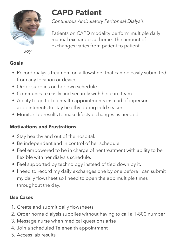
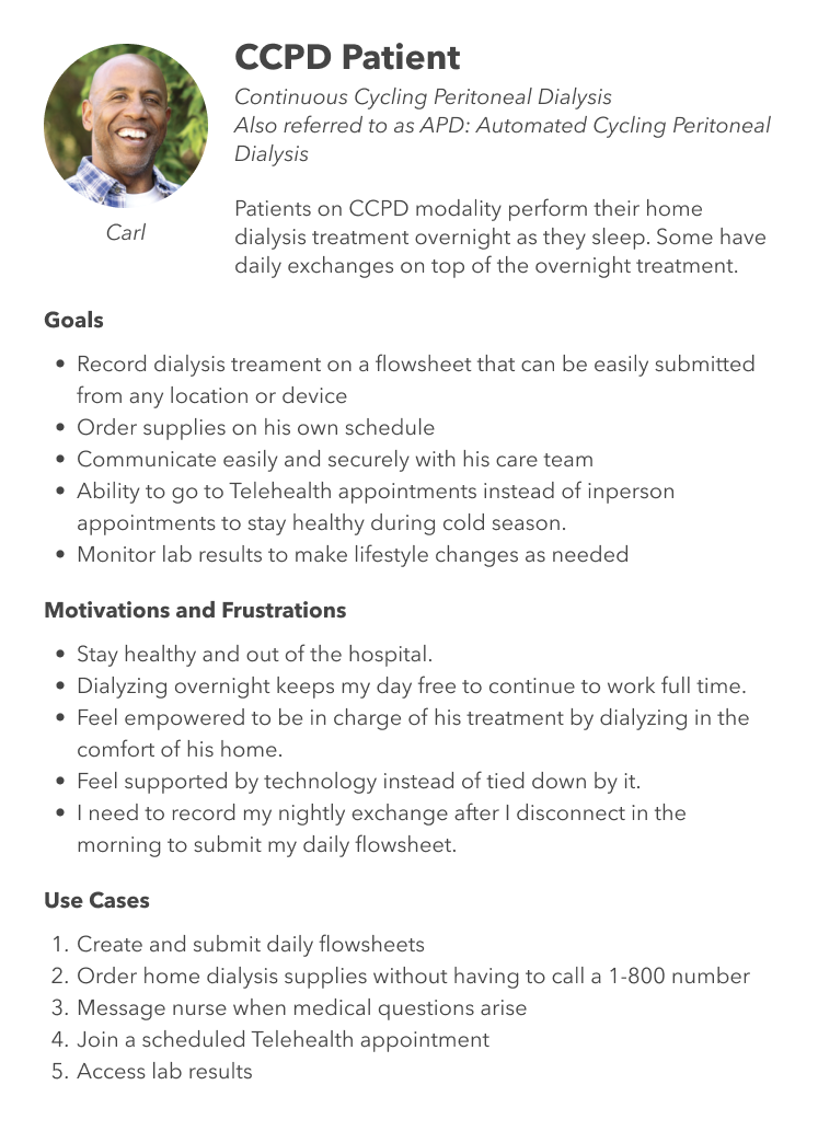
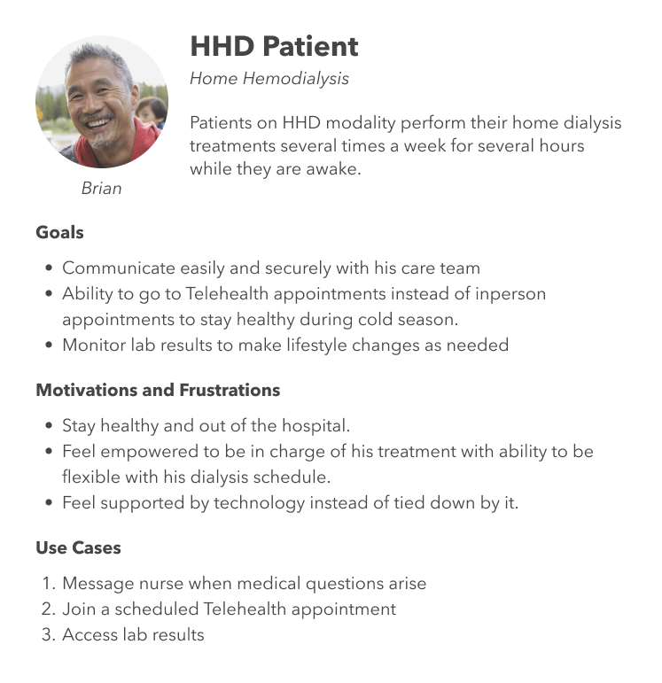
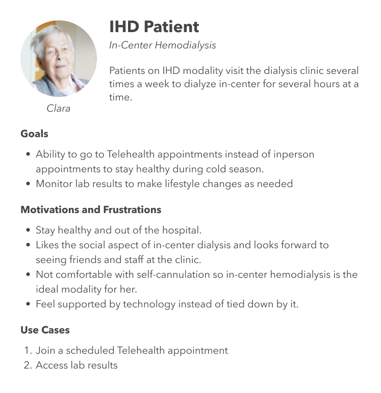
There are multiple treatment modalities offered to patients with end stage renal disease therapy. PatientHub serves each modality with a tailored experience to meet their individual needs because the treatment process looks very different for each user group.
Project Research TIMELINE
Research
We took findings from 9 different research studies over the past year to inform and prioritize which features we should focus on in the redesign.
Labs Results Study – We held semi-structured interviews with 5 patients to review preliminary screen designs for proposed app improvements. Qualitative feedback was sorted through a thematic analysis using an affinity diagram to determine high-level themes.
Vital Signs Study – We held semi-structured interviews with 7 patients to review preliminary screen designs for proposed app improvements. Qualitative feedback was sorted through a thematic analysis using an affinity diagram to determine high-level themes.
Ideas Forum Feedback Analysis – We analyzed and coded 313 forum posts and comments. There was a total of 1,394 upvotes across the 313 posts which were ranked by vote.
Number Pad Usability tests – We visited 3 clinics and had 14 patients test 3 different semi-functional prototypes as an alternative to the existing data entry keyboard. We measured each of the prototype's efficiency by 1) Number of Errors, 2) Time on Task, and 3) Self-described difficulty Likert scale.
Navigation Card Sort Study – Using OptimalWorkshop's online Card Sort tool, we asked 8 patients to rank our existing navigation into 3 categories: Most Important, Somewhat Important, and Least Important. This was to inform us which pages we should surface first and include on the new mobile bottom navigation menu.
First Flowsheet Mobile Design Feedback – We held semi-structured interviews with 5 patients to review revised screen designs for proposed app improvements. Qualitative feedback was sorted through a thematic analysis using an affinity diagram to determine high-level themes.
Second Flowsheet Mobile Design Feedback – We held semi-structured interviews with 7 patients to review revised screen designs for proposed app improvements. Qualitative feedback was sorted through a thematic analysis using an affinity diagram to determine high-level themes.
First Flowsheet Usability Tests – Our vendor partner conducted usability tests with 8 patients that was a combination of semi-structured interviews and structured activities to gather feedback on 3 unique semi-functional Flowsheet prototypes. Patients were asked to think aloud during these tests and to rank each of the prototypes by several attributes (resonance testing).
Second Flowsheet Usability Tests – Our vendor partner revised the previous set of prototypes to conduct a second round of usability tests with 6 patients. These too were a combination of semi-structured interviews and structured activities to gather feedback on 3 unique semi-functional Flowsheet prototypes. Patients were asked to think aloud during these tests and to rank each of the prototypes by several attributes (resonance testing).
incorporate user feedback
• Implement a custom numeric keyboard for some of the numeric input fields on mobile
• Anything on a desktop can be done on a mobile device
• Add push notifications
• Reduce the number of flowsheet questions to make submission easier. We hope this change can increase the number of flowsheet submissions to allow for better patient outcomes. It’s important that the care team is aware of any warning signs and can intervene when the patient is unwell.
• Update color scheme to match rebranding efforts.
• Simplify the supply ordering process
New look and components
The new look and feel is modern and matches the new branding guidelines. All of the accessibility goals and user feedback we received were included in the design changes.
Although the original project was created in Adobe XD we quickly converted the files to Figma post-launch. I single-handedly created and maintained a Figma component library of over 240+ components with variants and component properties based loosely on atomic design principles. Creating the component library was important to me because I was solely responsible to create 800+ screens within a 4 month period to support the dev team and could have greatly benefited from it prior to launch. Luckily, we are in a future-proof position now that the files are using the shared Figma library.
Before and After Gallery
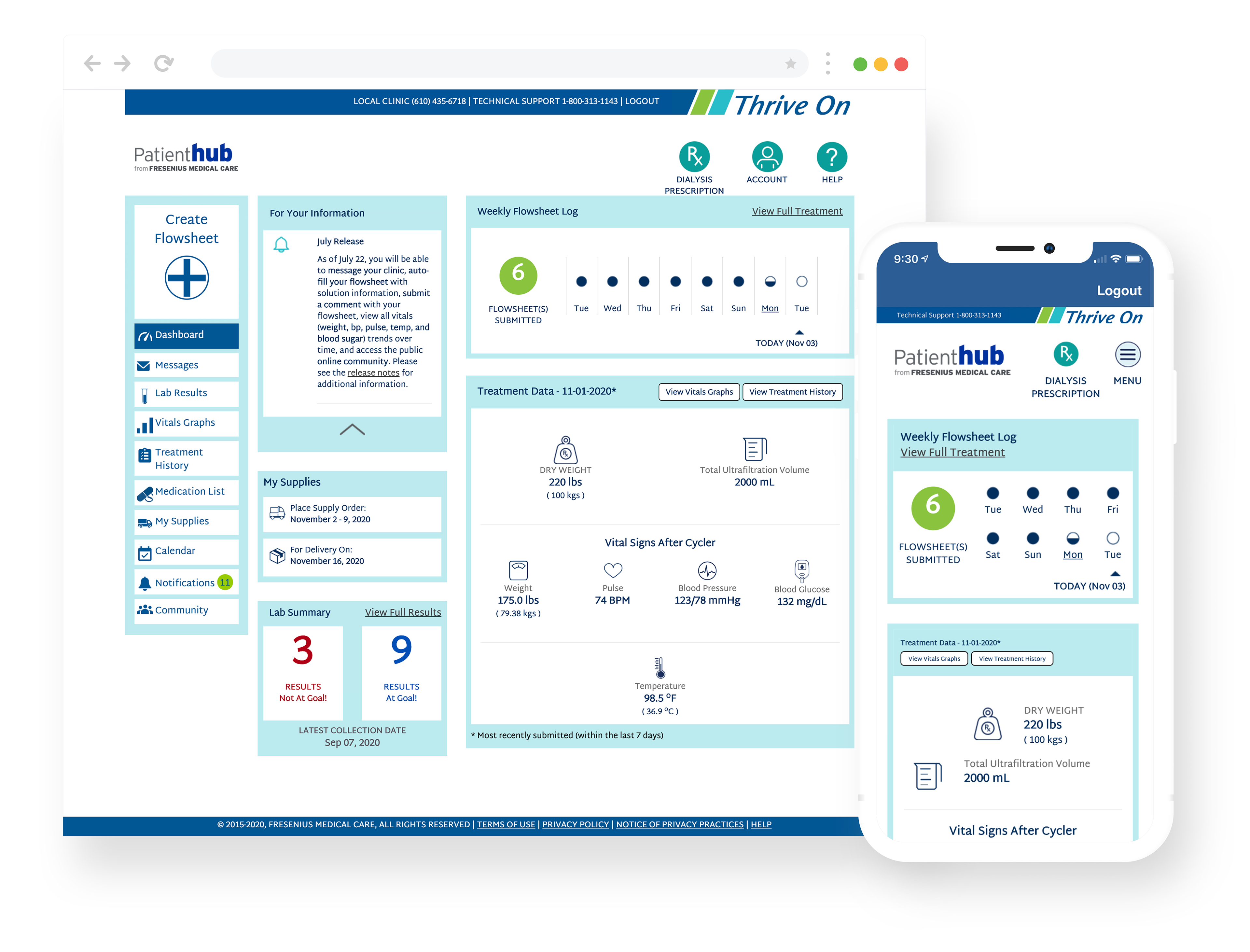
Dashboard Before
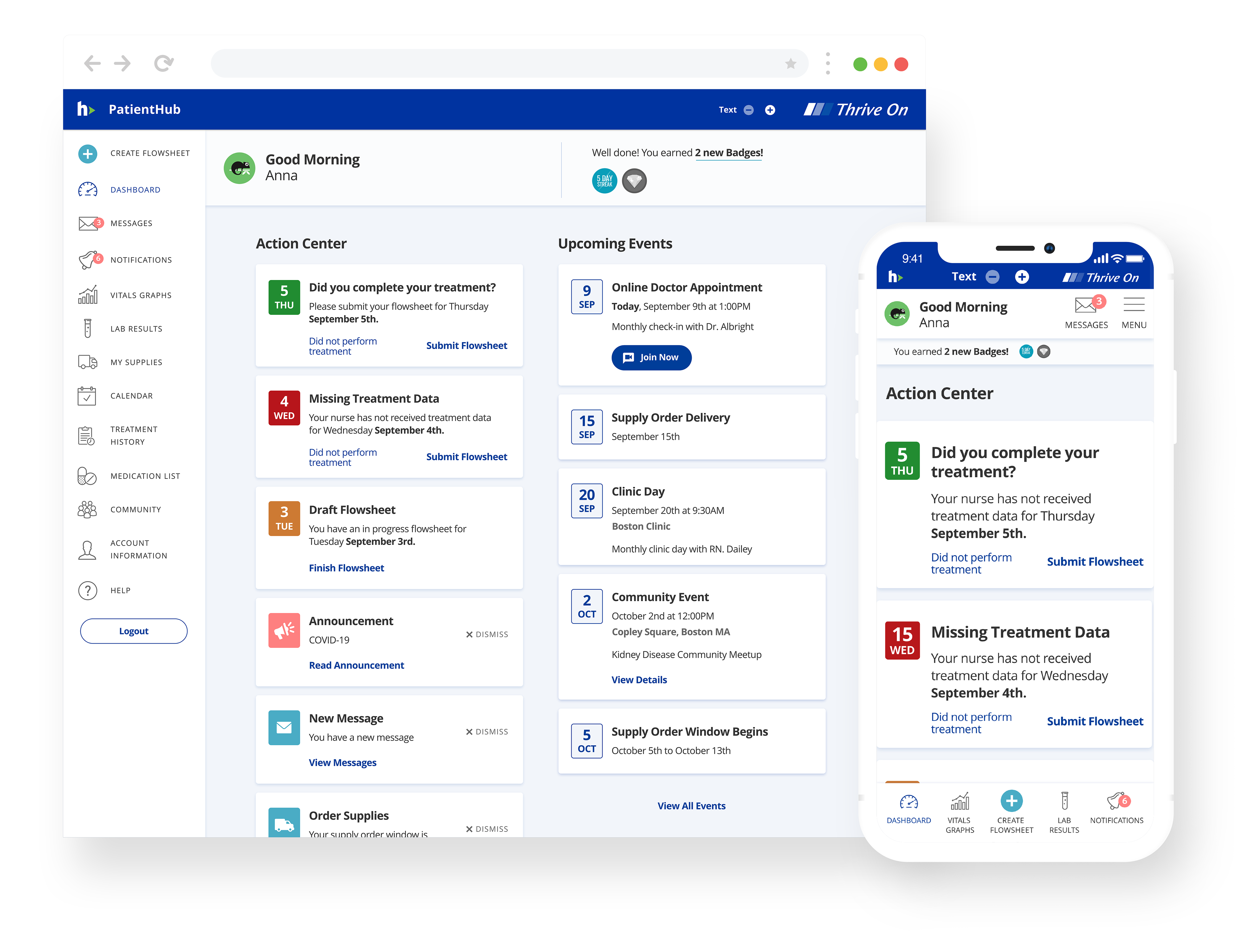
Dashboard After
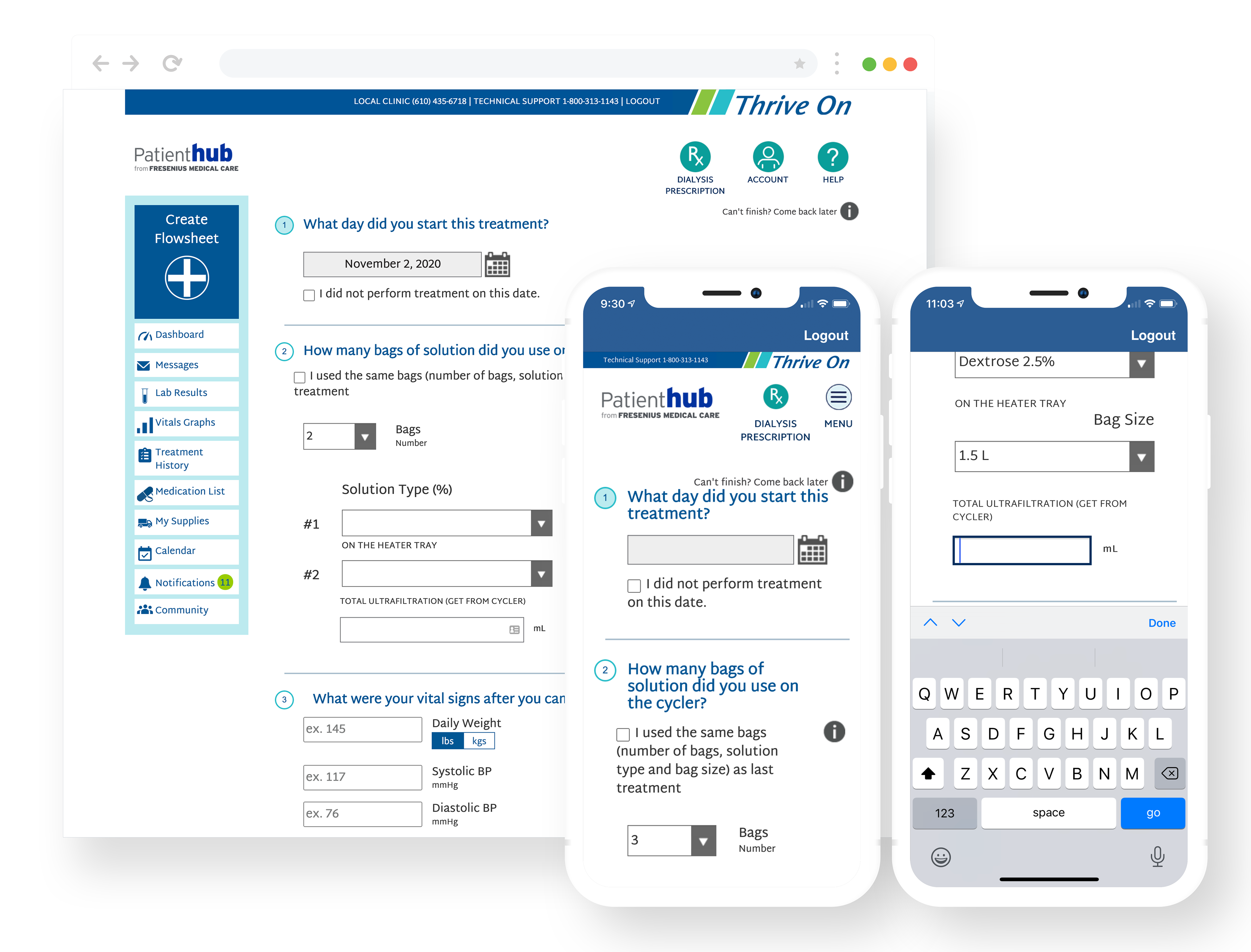
flowsheet before
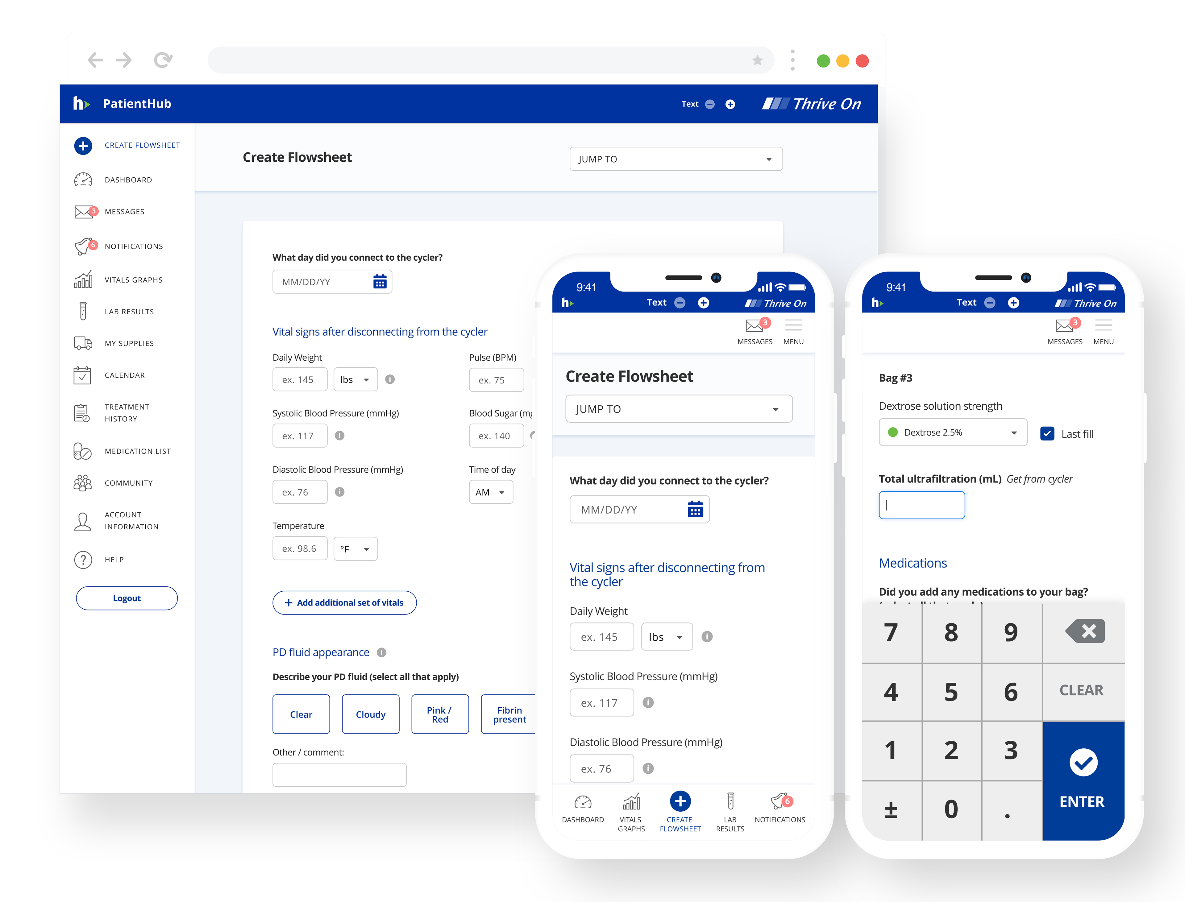
flowsheet after
Changes to Supply Ordering
We removed the 3-month wait time for users to access online ordering. We also introduced a training module on how to order through PatientHub in the standard training. We revised the ordering process to give patients the ability to pick a manual override instead of the supply calculator. This meant that seasoned patients who knew exactly what they needed could skip the usage calculator at the beginning of the ordering process and reduce their time ordering supplies. We saw more conversions and an overall increase in orders through the app.
Impact
A peer-reviewed study published article (Remote Treatment Monitoring on Hospitalization and Technique Failure Rates in Peritoneal Dialysis Patients) in Kidney 360, 2020 featured a retrospective analysis of more than 6k patients on peritoneal dialysis found that PD patients who regularly use apps like PatientHub are:
• 26% lower risk of hospitalization
• 27% lower technique failure rate
• 50% fewer hospital stays
• 27% lower technique failure rate
• 50% fewer hospital stays
Adoption and engagement
Since the release of the redesigned PatientHub app, there has been a 60% increase (between Jan 2020 - March 2022) in Adoption and Engagement by our home PD patients.
We also saw an increase in the number of patients using PatientHub for online ordering instead of ordering through customer service. This means fewer calls to representatives.
Promo Video
In addition to the many other contributions I made to this project, I was given the opportunity to create the promotional video below showcasing all of the new features of the new app.